The brief
Design a catalogue for an exhibition to be held at the Wits Art Museums, Jack Ginsberg Centre for Book Arts. The catalogue features 67 works that have been collected over a lifetime, as well as four essays that discuss the story, history and legacy of the works from the Caversham Press and the people who made it all possible.
The theme of the publication.
The idea of sharing will be central to the theme of the publication.
The colours, fonts and, layout must support this. The idea is to carry a vision from one person, country or generation, and to develop it, eventually sharing their created magic with the world.
Each author shares a bit of themselves in their work and as creatives we seek to share what think and feel with the world.
This is a catalogue that will be shared with many people, with the works presented being shared with Caversham. We live in a world where people share what they have and who they are through their power of creativity. I want the publication to reflect that. The history of the images of these creatives that shared their time, passion, and curiosity should not be lost but instead, amplified.
This is what makes the spirit of Masabelaneni, sharing one’s magic with the world.
This is what makes the spirit of Masabelaneni, sharing one’s magic with the world.
The fonts
Averia Serif Libre was be used on the cover as well as headings and subheadings.

Each character is made up of unique shapes that give the overall type a quirky style.
The font is still readable and will pair well with the images available for cover selection.
The history of the typeface is Averia Serif Libre is of a unique and distinctive typeface that defies classification.
The history of the typeface is Averia Serif Libre is of a unique and distinctive typeface that defies classification.
The font was created by averaging together all of the fonts on the computer of its creator, Dan Sayers.
This gives the font a hybrid appearance, with elements of both serif and sans-serif fonts. As a result, Averia Serif Libre can appear slightly blurry, but this also gives it a sense of depth and character. The font is not for everyone, but it is sure to turn heads wherever it is used.
Futura PT for table of contents, captions, running head, and folio.

Futura's geometric shapes and circular forms give it an air of efficiency and forward-thinking. The font was designed in 1927, and its clean, modern design was inspired by the Bauhaus movement.
Futura rejected the traditional approach to sans-serif fonts, which were often based on signpainting or nineteenth-century serif typefaces. Instead, Futura's designer, Paul Renner, created a font that was based on pure geometric shapes. This gave Futura a unique and distinctive appearance that has made it one of the most popular sans-serif fonts in the world.
EB Garamond for body copy.

This was done because according to its history, “Georg Duffner's font design was inspired by the 1592 Berner specimen. The italic and Greek characters were based on the work of Robert Granjon, and Cyrillic characters were added as well.
The font also includes OpenType features such as swash italic capitals and schoolbook alternates” (Garamond in Wikipedia 2023).
This long and shared history falls in with the overall theme of the publication, Masabelaneni, the power of sharing.
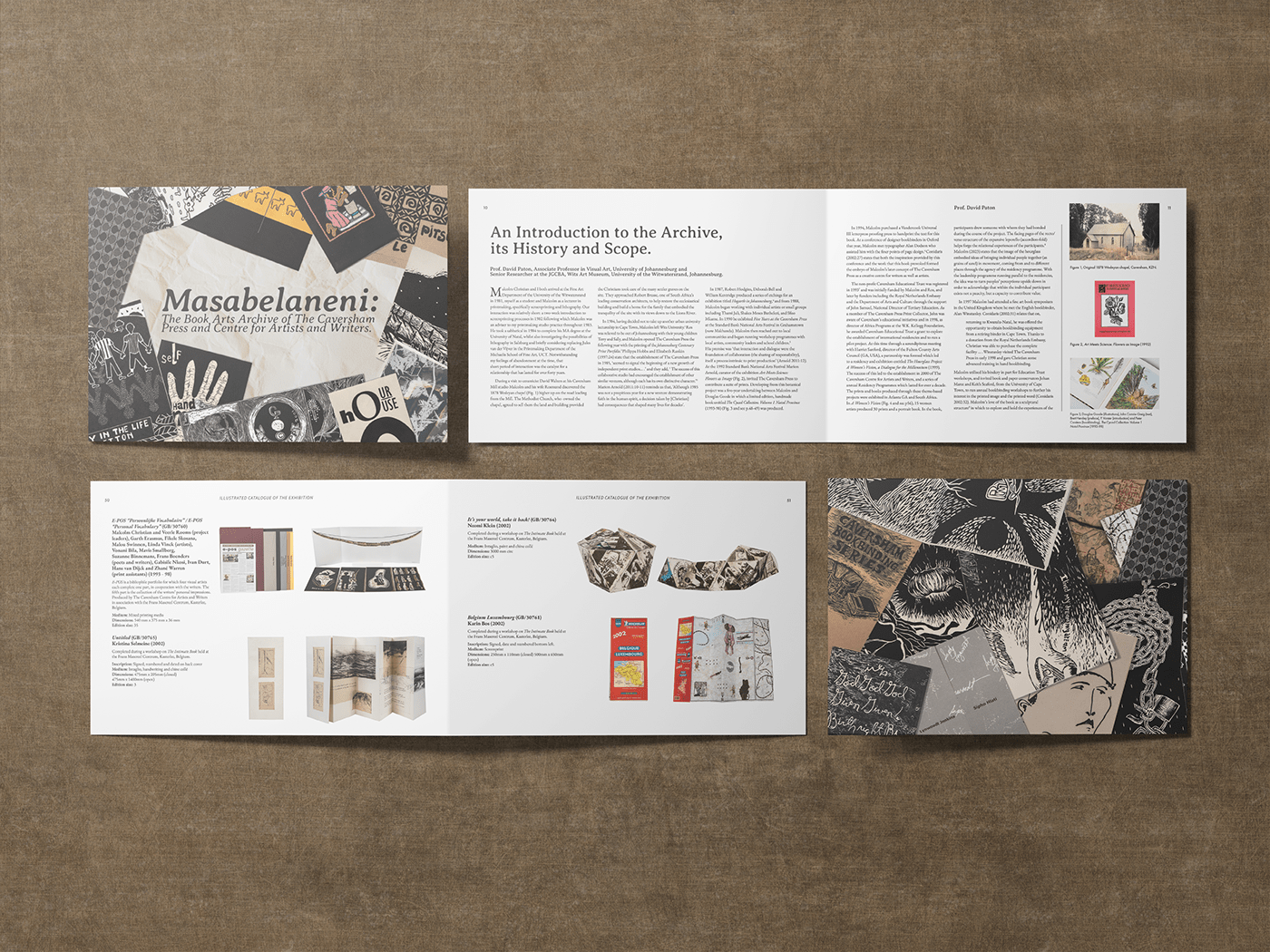
The full cover
This cover was a simple but effective way of carrying the theme of the publication to the front. On the front portion (your right) the books are in the formation of a sharing circle, a way in which many stories are told around the world. The back portion (your left) shows how the stories within the books as well as the stories within us, cross paths and are intertwined to create one image, that of humanity sharing their creativity.
The layout
The essays follow a three collumn grid on each page with figures and their captions on either side of each page.

The catalogue follows the same three collumn structure with two entries max per page.